01
Brand identity
Naming through to a finished system — marks, type, colour and the rules that keep them consistent once I hand over.
Brand and product design for companies that make something real — serving London, United Kingdom and specializing in Brand identity, Product design, Packaging.
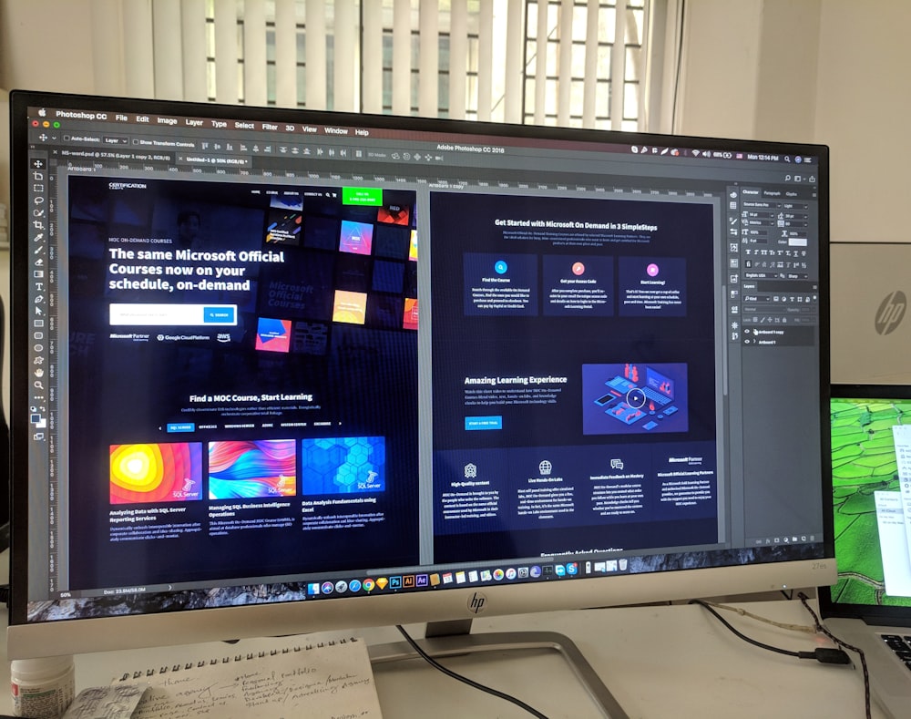
I trained as an industrial designer and moved into brand work when I realised the products I liked best were the ones whose packaging, interface and support pages all sounded like the same company. Twelve years later that is still the job: making the parts agree with each other. I work directly with founders, usually as the only designer, and I hand over systems rather than files — colour, type and spacing rules written so the next person does not have to guess what I meant.
Selected work

Brand & Packaging
Kestrel had a good frame and a catalogue that looked like a spreadsheet. We rebuilt the identity around the geometry of the frames themselves, then carried it into packaging that survives a courier and a shop floor. The wordmark is drawn to stay legible at head-tube size, which turned out to be the constraint that decided everything else about the system.

Identity
A studio pottery moving from market stalls into wholesale, which meant their labelling suddenly had to answer to buyers as well as customers. We kept the hand-drawn mark they were known for and built a typographic system around it disciplined enough for line sheets, invoices and a trade catalogue without losing what made people pick the pieces up.
Product Design
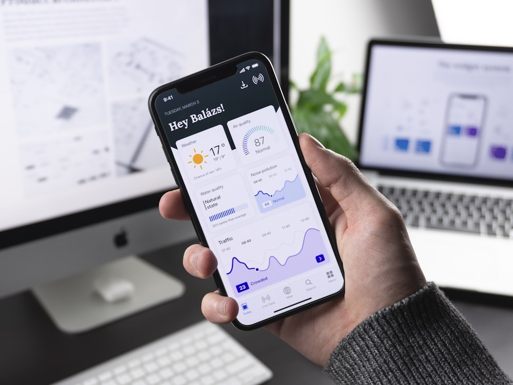
A companion app for a portable amplifier, designed for people using it outdoors with gloves on. Most of the work was subtraction — the first build had every setting on the main screen. We moved to three states that cover ninety percent of real use, and buried the rest where it stops being a distraction during the ten seconds someone actually looks at the screen.
Packaging
Preserved foods sold in a crowded chiller cabinet, where the only thing you can rely on is a shopper's peripheral vision. We built a labelling system around one high-contrast band that reads at two metres and a typographic hierarchy that rewards picking the jar up. Nineteen products now share one grid, which cut their artwork costs more than the redesign did.
What I do
End-to-end product work — from architecture and APIs to pixel-level interface polish.
How I work
Experience
Building a precision talent-hiring platform and a B2B network with Next.js, Node and AI.
An AI-powered real estate portal — web app plus a React Native mobile app.
Delivered client web apps, dashboards, CRMs and marketing sites across several industries.
E-commerce and business sites — storefronts, booking and reservation systems.
Testimonials
FAQ
Fixed price for a defined scope, quoted after a paid discovery conversation rather than before it. I have found hourly billing punishes the client for my thinking time and rewards me for being slow, which is the wrong incentive for both of us. Discovery is usually half a day, and if we decide not to work together you keep the notes and the positioning work regardless of what happens next.
Often, but not always at the very beginning. If you are still changing what the product is every fortnight, a finished identity is the wrong thing to buy and I will usually say so. What tends to work better at that stage is a short engagement on positioning and a deliberately provisional visual direction, then the full system once the thing you are selling has stopped moving underneath you.
Source files, exported assets in the formats your suppliers ask for, and written rules covering colour, type, spacing and the decisions I made that are not self-evident from looking at the artwork. The written part matters most. Files tell the next person what I did, and the rules tell them why, which is the only thing that stops a system drifting once I am no longer in the room.