01
Brand identity
Naming through to a finished system — marks, type, colour and the rules that keep them consistent once I hand over.
London, United KingdomTaking projects from March
Brand & Product Designer
Brand and product design for companies that make something real — serving London, United Kingdom and specializing in Brand identity, Product design, Packaging.
Scroll
I trained as an industrial designer and moved into brand work when I realised the products I liked best were the ones whose packaging, interface and support pages all sounded like the same company. Twelve years later that is still the job: making the parts agree with each other. I work directly with founders, usually as the only designer, and I hand over systems rather than files — colour, type and spacing rules written so the next person does not have to guess what I meant.
01About
Speaks English, Yoruba, PortugueseDownload CV
02What I do
01
Naming through to a finished system — marks, type, colour and the rules that keep them consistent once I hand over.
02
Interface work for teams without a designer in the room. Flows, screens, and a component library your engineers can build from.
03
Structural and surface design for physical products, taken through to print-ready artwork and a real conversation with your printer.
04
Documented rules so the next ten screens look like the first ten, whoever draws them and whenever they get drawn.
05
Photography and campaign direction, briefing and running shoots so the imagery matches everything else you have.
06
Two days with your team to get positioning and visual direction agreed before anyone opens a design tool.
03Selected work

Kestrel had a good frame and a catalogue that looked like a spreadsheet. We rebuilt the identity around the geometry of the frames themselves, then carried it into packaging that survives a courier and a shop floor. The wordmark is drawn to stay legible at head-tube size, which turned out to be the constraint that decided everything else about the system.
A studio pottery moving from market stalls into wholesale, which meant their labelling suddenly had to answer to buyers as well as customers. We kept the hand-drawn mark they were known for and built a typographic system around it disciplined enough for line sheets, invoices and a trade catalogue without losing what made people pick the pieces up.
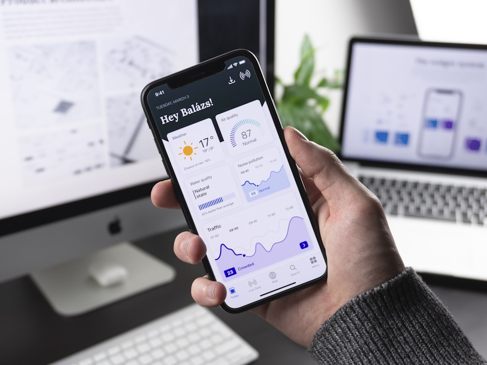
A companion app for a portable amplifier, designed for people using it outdoors with gloves on. Most of the work was subtraction — the first build had every setting on the main screen. We moved to three states that cover ninety percent of real use, and buried the rest where it stops being a distraction during the ten seconds someone actually looks at the screen.
Preserved foods sold in a crowded chiller cabinet, where the only thing you can rely on is a shopper's peripheral vision. We built a labelling system around one high-contrast band that reads at two metres and a typographic hierarchy that rewards picking the jar up. Nineteen products now share one grid, which cut their artwork costs more than the redesign did.
A hand-tool maker whose reputation was entirely word of mouth among people who already knew them. The brief was to look established without looking corporate, since their whole advantage is that a person answers the phone. We built an identity around their own technical drawings and a site that puts the specification first, because that is what their buyers actually read.
A roastery with eleven single origins and no way to tell them apart on a shelf. Rather than eleven designs we built one system with a colour axis for roast level and a numbering convention customers learned in about two visits. Reorder rates went up, which the owner attributes mostly to people finally being able to name the bag they liked last time.
04Kind words
Maya spent the first week in the workshop rather than at a desk, and it showed in everything that followed. She understood that the mark had to work stamped into wet clay before it worked anywhere else, which is not a constraint I had thought to explain. We came away with a system I have applied myself a dozen times since without needing to ask her what was allowed.
We had eighteen months of feature requests and an app that showed all of them at once. Maya's first deliverable was a list of things to remove, with the reasoning attached, and it was uncomfortable reading in the best way. Support tickets about the settings screen dropped to almost nothing after launch, which is the only metric I actually cared about.
What I valued most was being told no. We asked for a heritage look and Maya explained, with examples, why that would put us in the same bracket as companies charging half our price. She was right, and the version we shipped has aged far better than the one I originally asked for would have done.
05Get in touch
Tell me what you are making and where it is stuck. I reply to everything within two working days.